Sinevis Collaterals
About Sinevis Collaterals
Overview: Sinevis Collaterals is a leader in Cyber Security Services with over twenty-five years of expertise in consulting, implementation, and managed services, delivering tailored security solutions.
Location: Sinevis has a global presence in the UK, US, Middle East, Australia, and Singapore.
Target Market: Organizations seeking comprehensive security strategies, serving clients worldwide who prioritize robust protection.
Location: Sinevis has a global presence in the UK, US, Middle East, Australia, and Singapore.
Target Market: Organizations seeking comprehensive security strategies, serving clients worldwide who prioritize robust protection.
Branding Challenge
Sinevis needed a unified, standout brand identity that highlighted their cybersecurity expertise and global reach. The challenge was to convey trust and innovation consistently across regions, setting them apart in a competitive market.
“We wanted a brand identity that truly reflects our global reach and expertise in cybersecurity. BrandWorks helped us convey our commitment to innovation and trust across diverse regions, creating a cohesive and powerful presence in the industry.”
- Sinevis Collaterals Team
Our Approach
At BrandWorks, We crafted a cohesive brand identity for Sinevis by highlighting their expertise and global reach in cybersecurity. Focusing on trust and innovation, we designed a professional yet dynamic image that reinforces Sinevis’ reputation as a reliable provider across all regions.
Logo Construction
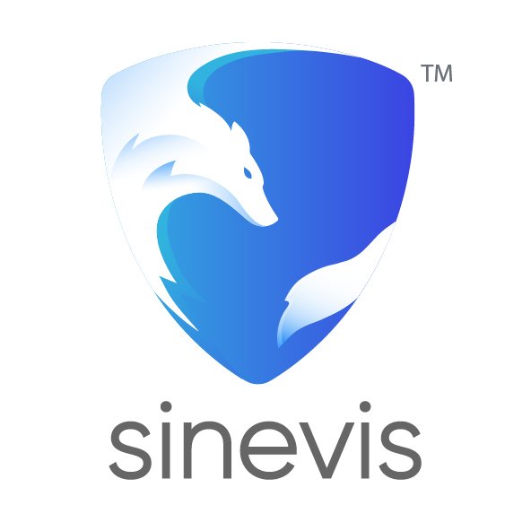
The Sinevis logo was designed to reflect their expertise and professionalism in cybersecurity. We focused on creating a clean, modern emblem that conveys trust and security, using minimalistic lines and strong shapes to communicate reliability. The logo integrates subtle nods to digital and network elements, emphasizing their tech-forward approach. With adaptable colors and forms, the logo maintains clarity and presence across different platforms and regions, aligning with Sinevis’ commitment to a cohesive, global brand identity.
Utilising the Golden Ratio
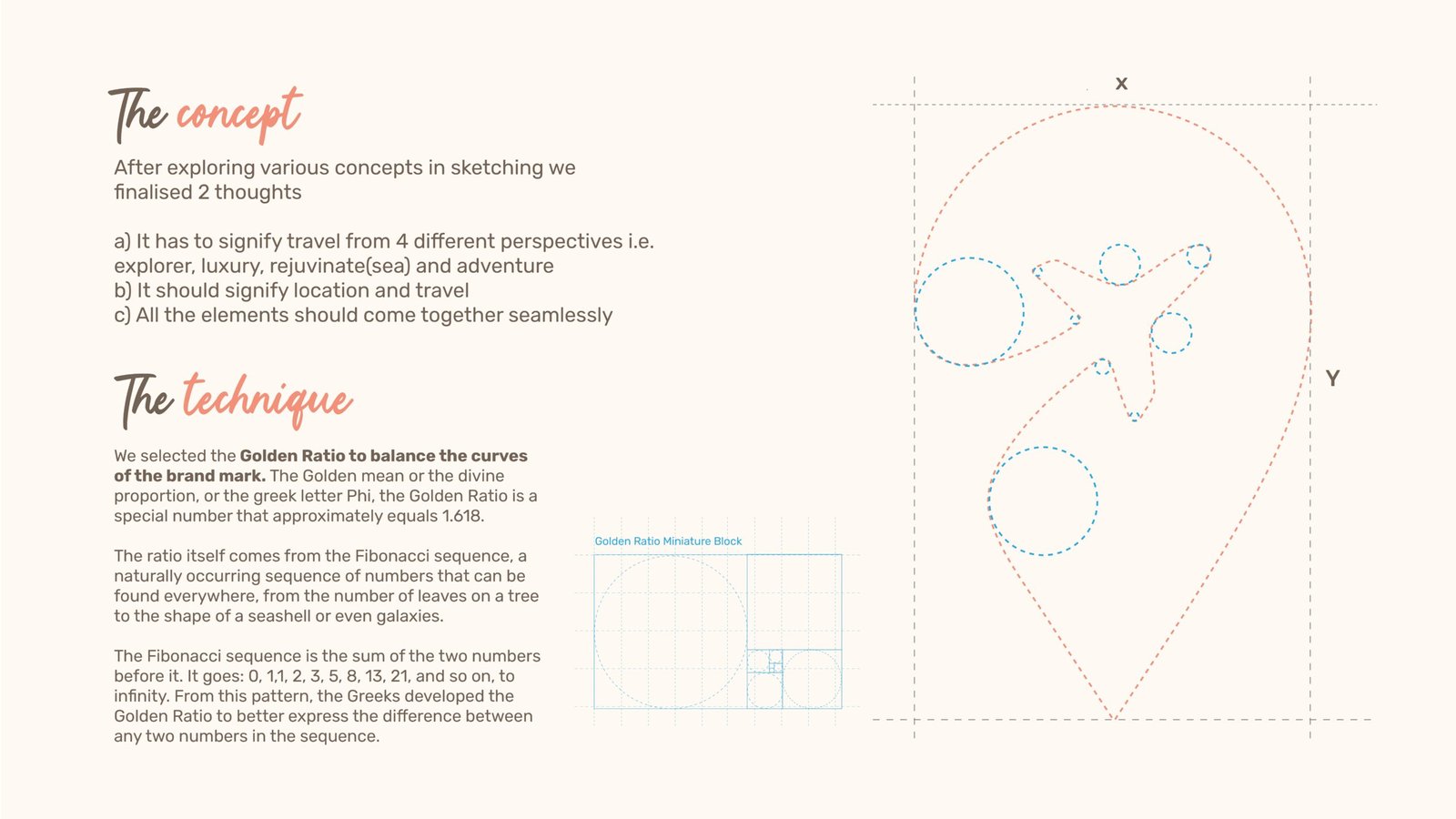
We selected the Golden Ratio to balance the curves
of the brand mark. The Golden mean or the divine
proportion, or the greek letter Phi, the Golden Ratio is a
special number that approximately equals 1.618.
The ratio itself comes from the Fibonacci sequence, a
naturally occurring sequence of numbers that can be
found everywhere, from the number of leaves on a tree
to the shape of a seashell or even galaxies.
The Fibonacci sequence is the sum of the two numbers
before it. It goes: 0, 1,1, 2, 3, 5, 8, 13, 21, and so on, to
infinity. From this pattern, the Greeks developed the
Golden Ratio to better express the difference between
x
Golden Ratio Miniature Block
Y
any two numbers in the sequence.
Colour Scheme
Colour schemes are crucial for brand identity, shaping perceptions and evoking emotions. We choose colours that reflect your brand’s values and ensure consistency across all platforms, enhancing recognition and impact.
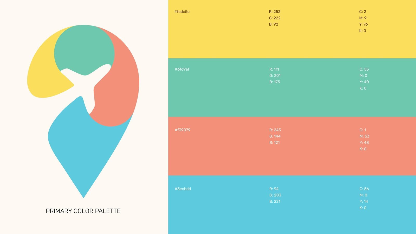
What Color Palette did we choose for Sinevis?
We chose the blue and white theme to align with Sinevis’ core values of trust, reliability, and professionalism in cybersecurity. Blue is widely recognized as a color that conveys stability and security, making it ideal for establishing a sense of assurance and expertise. The clean white background enhances readability and modernity, providing a balanced contrast that reinforces a sleek, approachable brand aesthetic. This palette not only conveys the Sinevis commitment to security but also ensures a cohesive, sophisticated look across all platforms.
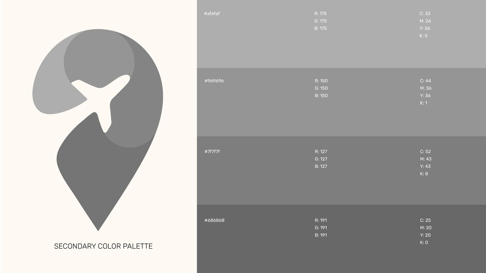
Secondary Color Palette
The secondary color palette complements the primary colors with a range of sophisticated neutrals. The light gray (#afafaf) provides a subtle backdrop, enhancing the vibrancy of the primary colors. The mid-tone gray (#969696) offers a sense of balance and professionalism, while the darker grays (#7f7f7f and #686868) add depth and versatility. This secondary palette supports various design applications, ensuring a cohesive and refined look that reinforces Sinevis Collaterals’ brand identity across all platforms.
Typography
Typography is essential to defining a brand’s identity. The right fonts communicate your brand’s personality, create consistency, and enhance recognition. Therefore, we choose typography that aligns with your message, ensuring clarity and impact across all platforms.
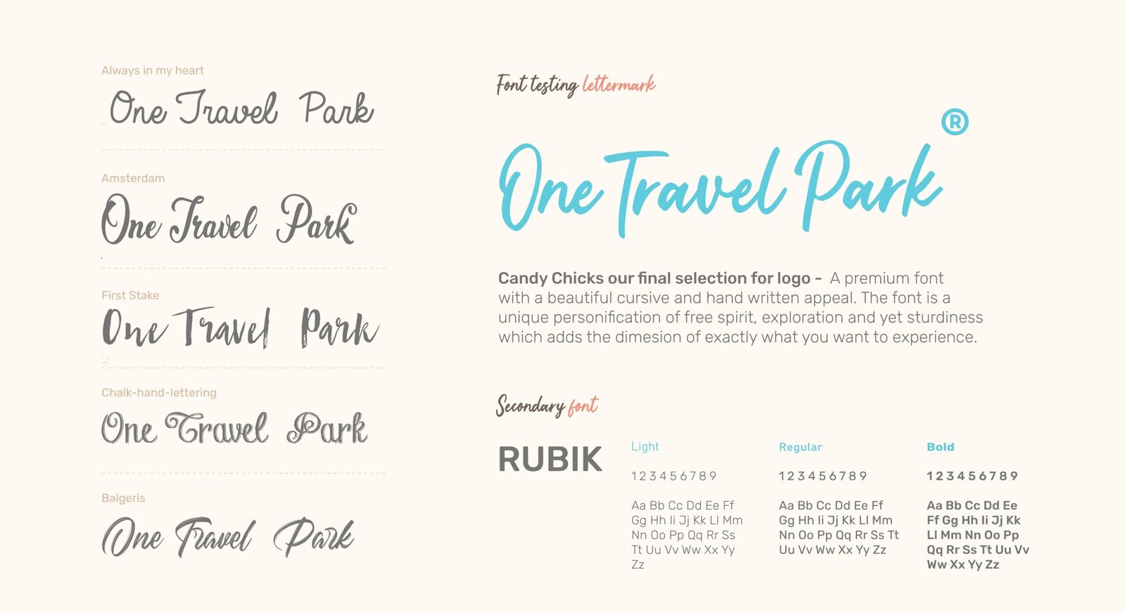
What fonts did we use?
Candy Chicks our final selection for logo – A premium font
with a beautiful cursive and hand written appeal. The font is a
unique personification of free spirit, exploration and yet sturdiness
which adds the dimesion of exactly what you want to experience.
Secondary Font
We chose RUBIK as the secondary font for One Travel Park due to its modern, geometric design and rounded edges, which convey approachability and warmth, reinforcing our brand’s commitment to personalized, diverse travel experiences.
