Reboot
About Reboot
Overview: Reboot is a Dubai-based fitness challenge brand focused on helping people reignite their fitness journey from home. We crafted a vibrant and energetic brand identity to reflect their mission of empowering individuals to stay active.
Location: Dubai
Target Market: Targeting both beginners and fitness enthusiasts, Reboot offers a dynamic, home-based fitness platform designed for anyone looking to bounce back into shape with strength and vitality.
Location: Dubai
Target Market: Targeting both beginners and fitness enthusiasts, Reboot offers a dynamic, home-based fitness platform designed for anyone looking to bounce back into shape with strength and vitality.
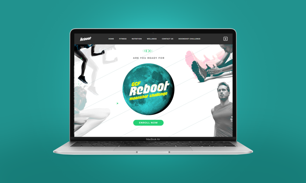
Branding Challenge
TruLabs approached us with the goal of designing a dynamic, approachable brand that captured the energy of a fitness journey from home. It needed to inspire and resonate with a diverse audience while reflecting Reboot's mission to help users bounce back into fitness.
"We're redefining the way people approach fitness from home. Reboot isn’t just another workout program—we aim to set new standards in motivation, accessibility, and results. We're transforming the fitness journey by being bold, challenging conventions, and leading a movement towards a healthier, more energized lifestyle."
- Reboot Team
Our Approach
At BrandWorks, We approached Reboot’s branding to emphasize energy, motivation, and accessibility for both fitness enthusiasts and beginners. Our strategy highlighted Reboot’s mission to inspire home-based fitness, using dynamic storytelling and bold visuals. Collaborating closely with Reboot, we ensured every design choice reinforced their goal of leading the home fitness challenge market.

Logo Construction

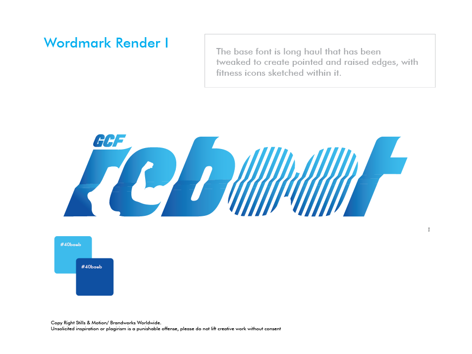
For Reboot, we designed a logo that captures the brand’s energy, motivation, and focus on home-based fitness.
The design features bold lines and vibrant blues to convey movement and enthusiasm, reflecting Reboot’s commitment to inspiring fitness and transforming users’ their health journey from home.
The design features bold lines and vibrant blues to convey movement and enthusiasm, reflecting Reboot’s commitment to inspiring fitness and transforming users’ their health journey from home.
Artistically Crafting the Watermark
We designed a watermark for Reboot that complements the logo and underscores the brand’s dynamic identity. Its subtle design protects and enhances Reboot’s visual assets while maintaining a modern, clean look, reinforcing the brand’s commitment to quality and originality.

Colour Scheme
Colour schemes are crucial for brand identity, shaping perceptions and evoking emotions. We choose colours that reflect your brand’s values and ensure consistency across all platforms, enhancing recognition and impact.
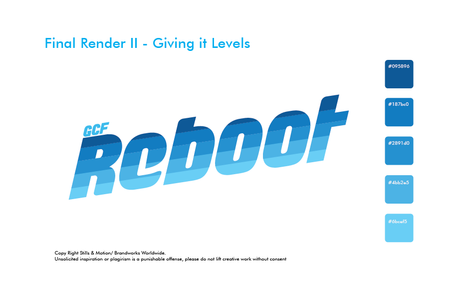

What Color Palette did we use?
We selected this particular colour palette for Reboot to evoke a sense of energy and vitality. The varying shades of blue represent trust, reliability, and dynamism—key qualities for a fitness brand. The gradient from deep to light blue creates a sense of movement and progression, aligning with Reboot’s mission to energize and motivate users on their fitness journey.
Typography
Typography is essential to defining a brand’s identity. The right fonts communicate your brand’s personality, create consistency, and enhance recognition. Therefore, we choose typography that aligns with your message, ensuring clarity and impact across all platforms.


What fonts did we use?
Longhaul is a bold, modern sans serif font designed to convey strength and energy. Available in multiple weights, it offers flexibility for various design applications, from impactful headlines to clear body text.
Key design features include wide, sturdy letterforms with a strong geometric structure, balanced proportions, and slightly rounded edges for a touch of approachability. Its high legibility makes it ideal for both digital and print use, ensuring clarity and presence across a range of platforms.
Key design features include wide, sturdy letterforms with a strong geometric structure, balanced proportions, and slightly rounded edges for a touch of approachability. Its high legibility makes it ideal for both digital and print use, ensuring clarity and presence across a range of platforms.
Why did we choose Longhaul?
We chose Longhaul for Reboot’s branding to reflect the energy and strength of the fitness brand. Its bold, sturdy design conveys power, while the rounded edges add approachability. The font’s legibility ensures clarity across all platforms, reinforcing Reboot’s dynamic and motivating identity.
Sub Brands
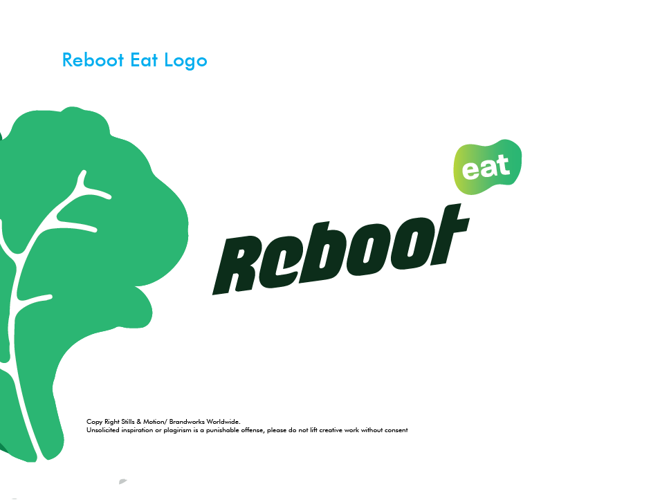
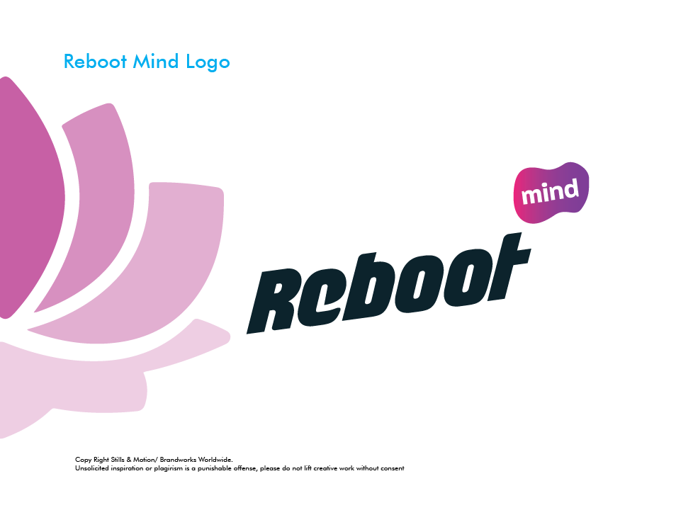

For Reboot’s sub-brands—Reboot Eat, Reboot Mind, and Reboot Fit—we created cohesive yet distinct identities. Each sub-brand was designed with its own color scheme and visual elements to reflect its unique focus: nutrition for Reboot Eat, mental well-being for Reboot Mind, and physical fitness for Reboot Fit. Despite their individuality, all three sub-brands maintain a consistent overall aesthetic tied to Reboot’s energetic and motivational brand, creating a unified experience for users.
