One Travel Park
About One Travel Park
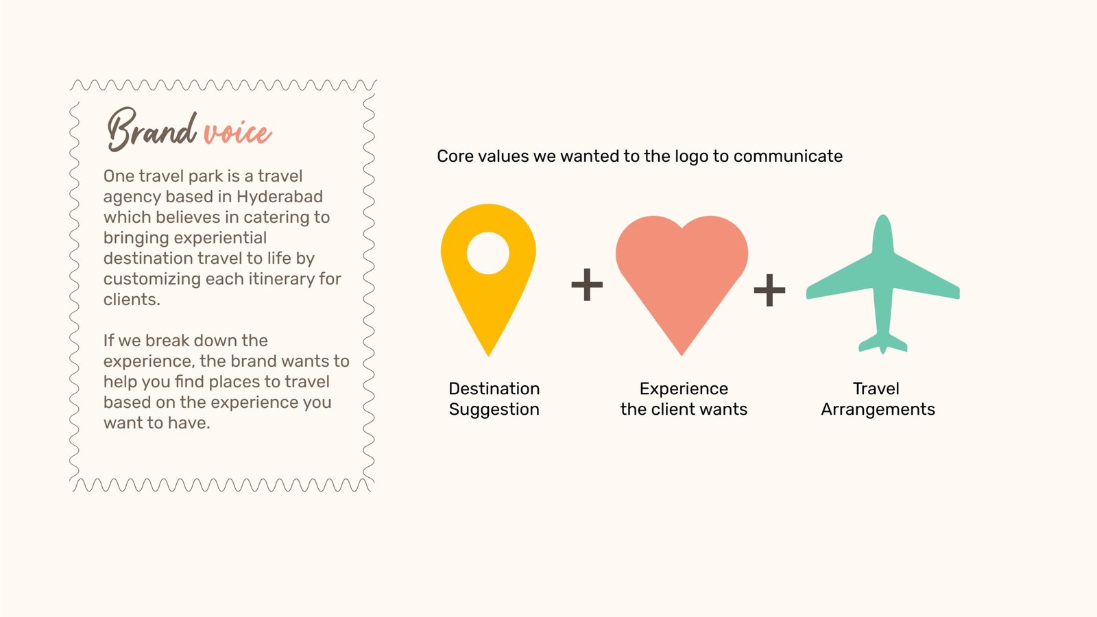
Overview: One travel park is a travel
agency based in Hyderabad
which believes in catering to
bringing experiential
destination travel to life by
customizing each itinerary for
clients.
Location: India
Target Market: Travelers seeking personalized, experience-based itineraries, from adventure and culture enthusiasts to luxury and relaxation seekers.
Location: India
Target Market: Travelers seeking personalized, experience-based itineraries, from adventure and culture enthusiasts to luxury and relaxation seekers.
Branding Challenge
One Travel Park approached us with a mission: to establish themselves as the go-to agency for experience-driven travel—whether it’s exploration, luxury, rejuvenation, or adventure. The challenge was to create a cohesive brand identity that seamlessly conveys a sense of place, travel, and unique, customized itineraries.
"Our vision is to guide travelers in discovering destinations that match the experiences they seek—whether it's adventure, luxury, rejuvenation, or exploration. We’re passionate about creating journeys that are as unique as each traveler."
- One Travel Park Team
Our Approach
At BrandWorks, We approached One Travel Park’s branding by emphasizing personalization and diverse travel experiences. Our strategy highlights the brand's mission to help clients find destinations tailored to their desires—adventure, luxury, rejuvenation, or exploration—using storytelling and evocative visuals to position One Travel Park as a leader in customized itineraries.
Logo Construction

The logo for One Travel Park is designed to encapsulate the essence of personalized travel experiences. It combines distinct elements that represent the four core perspectives: exploration, luxury, rejuvenation, and adventure. The typography is clean and modern, conveying professionalism and approachability, while the color palette reflects a sense of wanderlust and tranquility. The integration of symbolic imagery—such as stylized paths or location markers—reinforces the brand’s commitment to guiding travelers on unique journeys, making the logo both memorable and meaningful.
Utilising the Golden Ratio
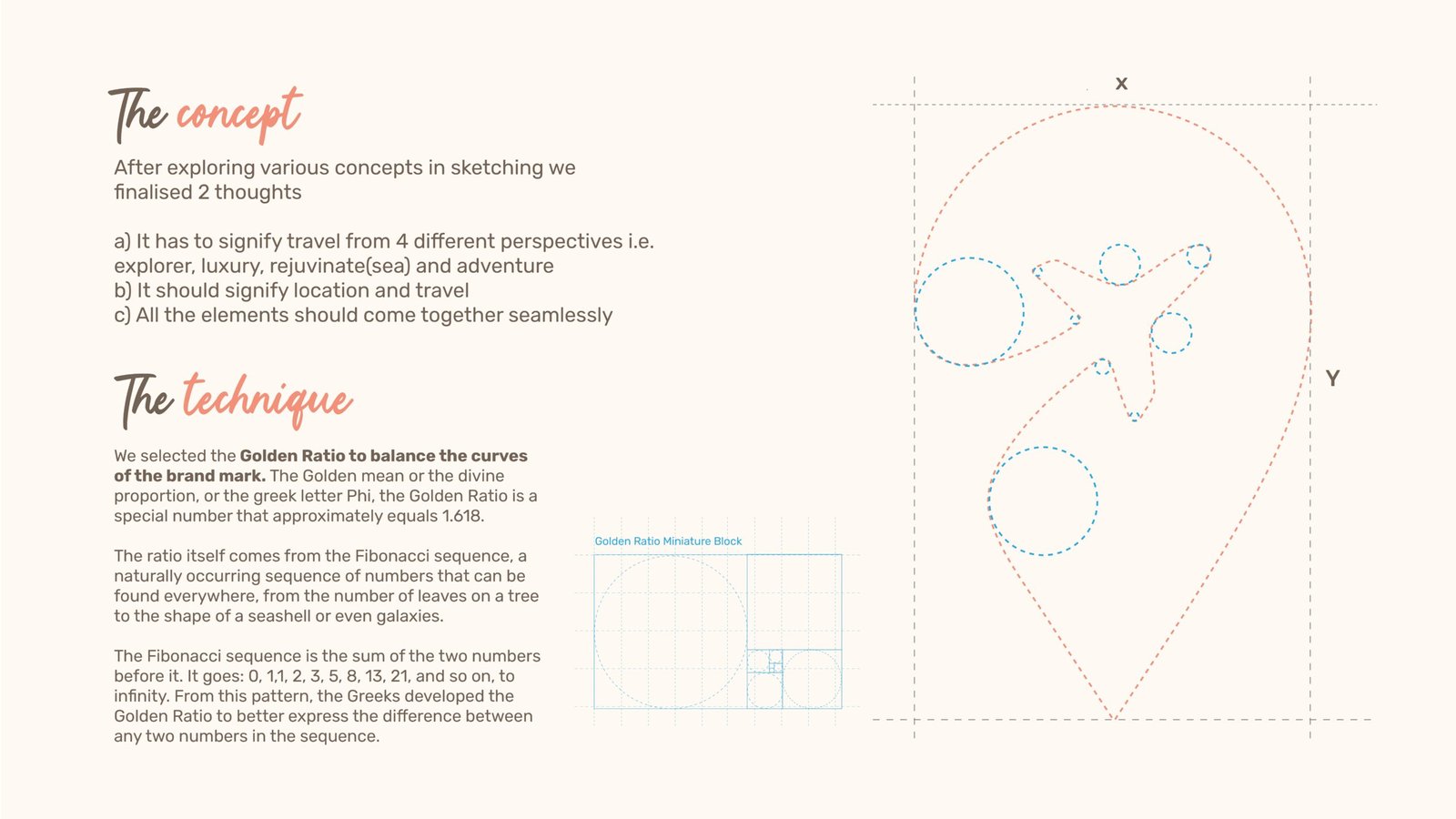
We selected the Golden Ratio to balance the curves
of the brand mark. The Golden mean or the divine
proportion, or the greek letter Phi, the Golden Ratio is a
special number that approximately equals 1.618.
The ratio itself comes from the Fibonacci sequence, a
naturally occurring sequence of numbers that can be
found everywhere, from the number of leaves on a tree
to the shape of a seashell or even galaxies.
The Fibonacci sequence is the sum of the two numbers
before it. It goes: 0, 1,1, 2, 3, 5, 8, 13, 21, and so on, to
infinity. From this pattern, the Greeks developed the
Golden Ratio to better express the difference between
x
Golden Ratio Miniature Block
Y
any two numbers in the sequence.
Colour Scheme
Colour schemes are crucial for brand identity, shaping perceptions and evoking emotions. We choose colours that reflect your brand’s values and ensure consistency across all platforms, enhancing recognition and impact.
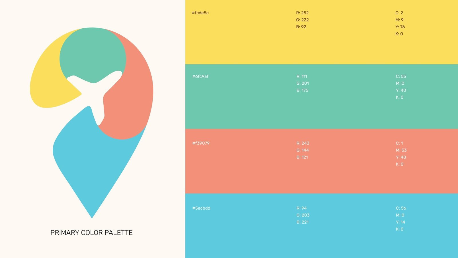
What Color Palette did we choose for One Travel Park?
The color palette for One Travel Park features a blend of vibrant and soothing tones that capture the essence of diverse travel experiences. The soft yellow (#fcde5c) evokes warmth and optimism, representing adventure and joy. The calming teal (#6fc9af) symbolizes rejuvenation and tranquility, perfect for serene destinations. The coral pink (#f39079) adds a touch of excitement and vibrancy, inviting exploration. Lastly, the cool aqua (#5ecbdd) reflects the spirit of travel and connection. Together, these colors create a harmonious balance that embodies One Travel Park’s commitment to personalized, experience-driven travel.
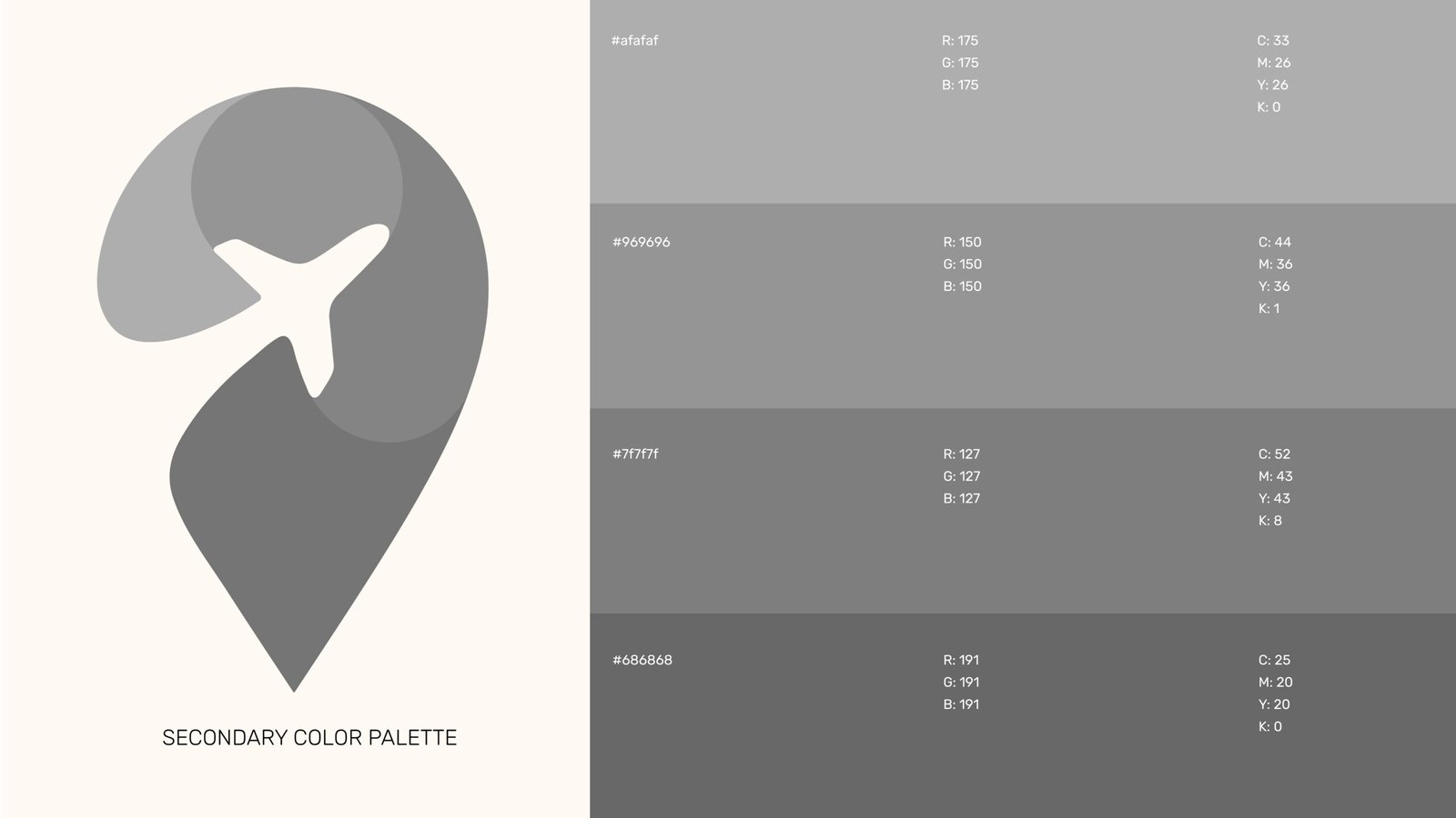
Secondary Color Palette
The secondary color palette complements the primary colors with a range of sophisticated neutrals. The light gray (#afafaf) provides a subtle backdrop, enhancing the vibrancy of the primary colors. The mid-tone gray (#969696) offers a sense of balance and professionalism, while the darker grays (#7f7f7f and #686868) add depth and versatility. This secondary palette supports various design applications, ensuring a cohesive and refined look that reinforces One Travel Park’s brand identity across all platforms.

Gradients
The gradients used in One Travel Park’s branding create a dynamic visual experience that reflects the brand’s energy and versatility. The combination of colors like the bright blue (#29ABE2) and vibrant orange (#F15A24) generates a sense of excitement and adventure, ideal for capturing attention. The teal (#6FC9AF) and warm yellow (#FCDE5B) gradient adds a touch of serenity and optimism, perfect for evoking the calming aspects of travel. These gradients enhance various design elements, creating depth and movement while reinforcing the brand’s mission to offer tailored, experience-driven journeys.
Typography
Typography is essential to defining a brand’s identity. The right fonts communicate your brand’s personality, create consistency, and enhance recognition. Therefore, we choose typography that aligns with your message, ensuring clarity and impact across all platforms.
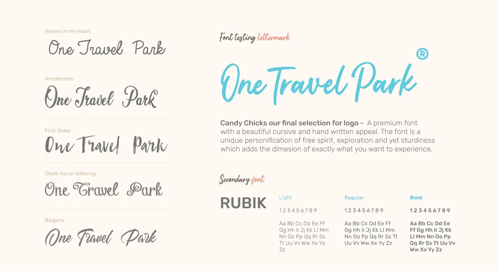
What fonts did we use?
Candy Chicks our final selection for logo – A premium font
with a beautiful cursive and hand written appeal. The font is a
unique personification of free spirit, exploration and yet sturdiness
which adds the dimesion of exactly what you want to experience.
Secondary Font
We chose RUBIK as the secondary font for One Travel Park due to its modern, geometric design and rounded edges, which convey approachability and warmth, reinforcing our brand’s commitment to personalized, diverse travel experiences.
Tagline Usage
The tagline "Unlock the World" encapsulates One Travel Park's mission to provide travelers with access to unique, personalized experiences. This evocative phrase invites potential clients to explore new destinations and adventures tailored to their desires.
We decided to place the tagline at a 45° angle, positioned at 1/12 x to touch the top of the "W" in "World." This placement creates a dynamic visual element that draws the eye while emphasizing the connection between the brand name and the experiences it offers. Using the typeface "Mismo" adds a contemporary feel, reinforcing the brand's modern identity and enhancing overall readability. This strategic design choice effectively integrates the tagline into the brand's visual narrative, making it memorable and impactful.

Stylescapes & Logo Variations
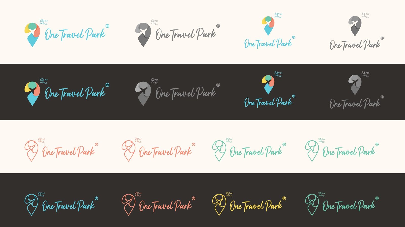
These stylescapes add another dimension to the One Travel Park logo, inspired by the thought of a postal stamp and an amalgamation of each line denoting a round of trip. This approach surely adds a clear, beautiful dimension to the One Travel Park logo.

Alongside the stylescapes, we also explore various logo variations, showcasing how different color combinations, backgrounds, and text placements can enhance brand visibility. These adaptations ensure that One Travel Park remains visually compelling and recognizable across diverse applications while maintaining its core identity.
Merchandise
One Travel Park’s merchandise enhances brand identity and customer engagement. Items like tagline stickers, visiting cards, and custom tags reflect our commitment to personalized travel experiences, ensuring memorable interactions with the brand.
Tagline Stickers

Tagline stickers featuring "Unlock the World" serve as a fun and engaging way to promote the brand. These stickers can be affixed to travel gear or souvenirs, reminding travelers of their journey and the personalized experiences that One Travel Park offers.
Letterheads

The letterheads are crafted to maintain brand consistency in all official communications. Featuring the logo and color scheme, they enhance the professional image of One Travel Park, making correspondence feel more personal and connected.
Visiting Cards

The visiting cards are designed with the brand's color palette and typography, ensuring a professional yet inviting appearance. They make a strong impression, reflecting One Travel Park's commitment to personalized service while providing essential contact information.
Custom Tags

Custom tags for travel packages and products emphasize the personalized experience offered by One Travel Park. These tags not only showcase the brand's identity but also add a special touch to each travel package, enhancing the overall customer experience.
looking for
branding solutions?
Let's get in touch
We’re here to help you build a unique brand identity that resonates. Contact us today to start your journey!
