Tiny Treasures
About Tiny Treasures
Overview: Tiny Treasures is an Indian startup focusing on customizing baby care products based on the age group. The idea is to simplify and provide all the things a mother needs to take care of a newborn till the age of 2 years.
Location: India
Target Market: Tiny Treasures targets new and expecting mothers, offering customized baby care essentials for newborns up to age 2, simplifying the journey of motherhood.
Location: India
Target Market: Tiny Treasures targets new and expecting mothers, offering customized baby care essentials for newborns up to age 2, simplifying the journey of motherhood.

Branding Challenge
The branding challenge for Tiny Treasures is to create a unique identity that conveys trust, care, and simplicity, while standing out in the competitive baby care market with its age-specific, customizable products.
"Our goal at Tiny Treasures is to simplify parenthood by providing personalized, age-specific baby care products that ensure every mother has what she needs to nurture her little one with ease and confidence."
- Tiny Treasures Team
Our Approach
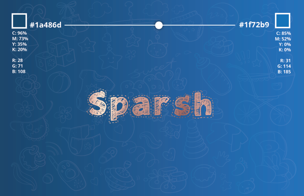
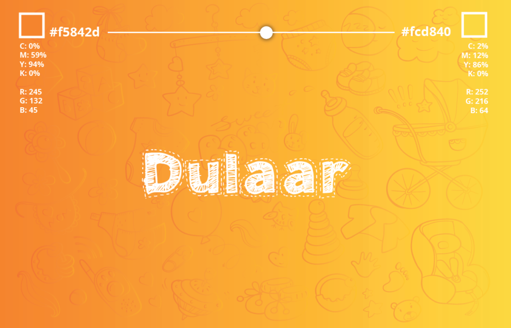
At BrandWorks, Our branding for Tiny Treasures focuses on a bright, premium identity with a playful edge. Each of the nine product categories has its own unique color and style, while the main logo remains consistent, ensuring a cohesive yet vibrant brand that reflects simplicity and customization in baby care.

Logo Construction

For Benchmark, we designed a logo that embodies the brand’s dedication to clarity and precision in data analytics.
The design features the use bars and thresholds to symbolize data measurement and surpassing limits. Clean lines and a dynamic color palette highlight Benchmark’s focus on transforming data into actionable insights, reflecting their leadership and innovation in analytics.
The design features the use bars and thresholds to symbolize data measurement and surpassing limits. Clean lines and a dynamic color palette highlight Benchmark’s focus on transforming data into actionable insights, reflecting their leadership and innovation in analytics.
Utilising the Golden Ratio
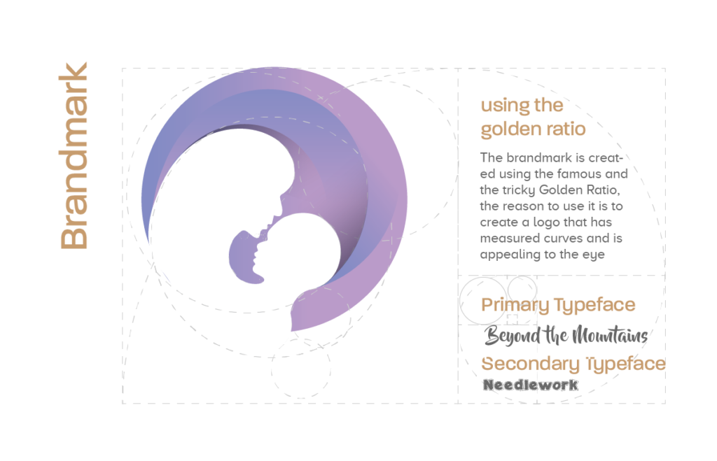
We applied the golden ratio to the Tiny Treasures logo to create natural balance and harmony. This principle guided the proportions of every curve and element, resulting in a visually cohesive design that exudes charm and elegance. The use of the golden ratio ensures the logo remains versatile and appealing across various applications, reflecting the brand’s nurturing nature.
Colour Scheme
Colour schemes are crucial for brand identity, shaping perceptions and evoking emotions. We choose colours that reflect your brand’s values and ensure consistency across all platforms, enhancing recognition and impact.
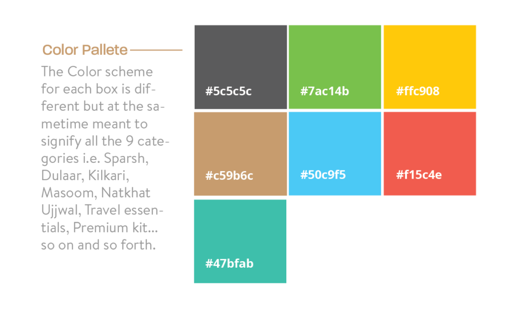
What Color Palette did we use?
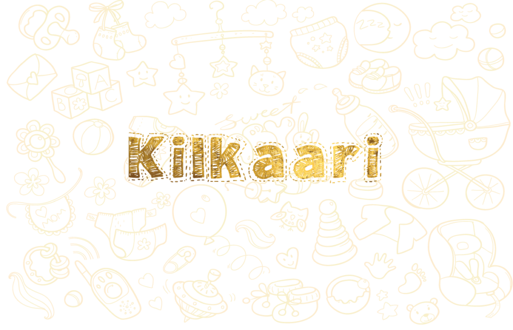
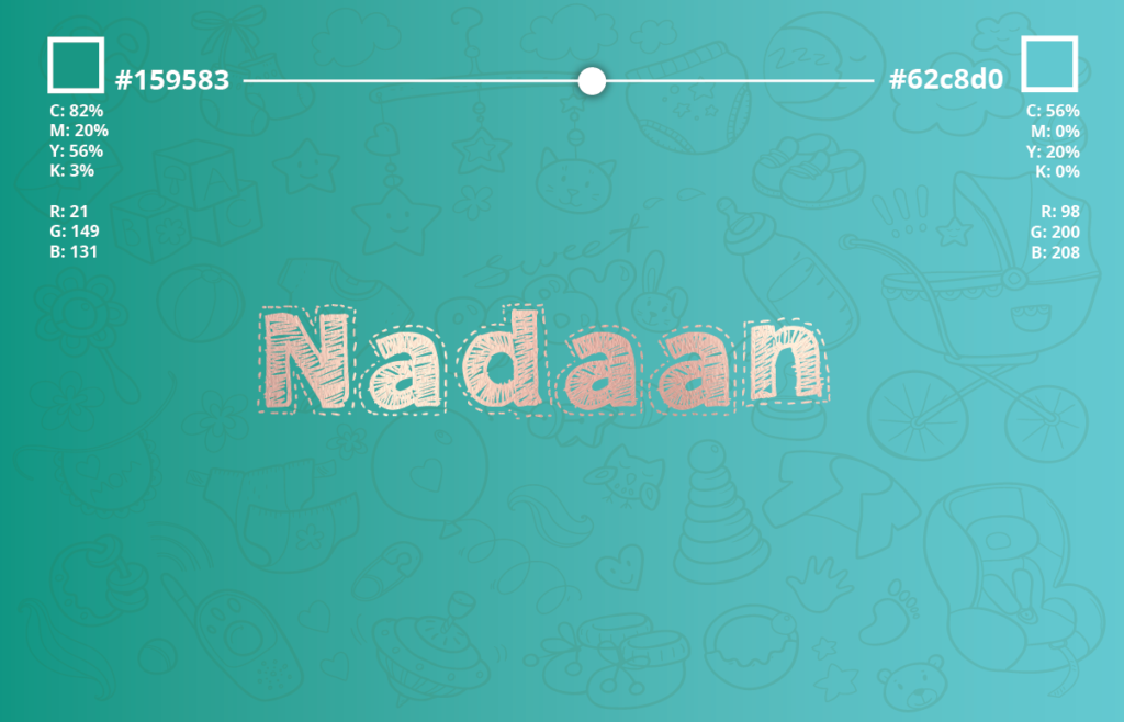
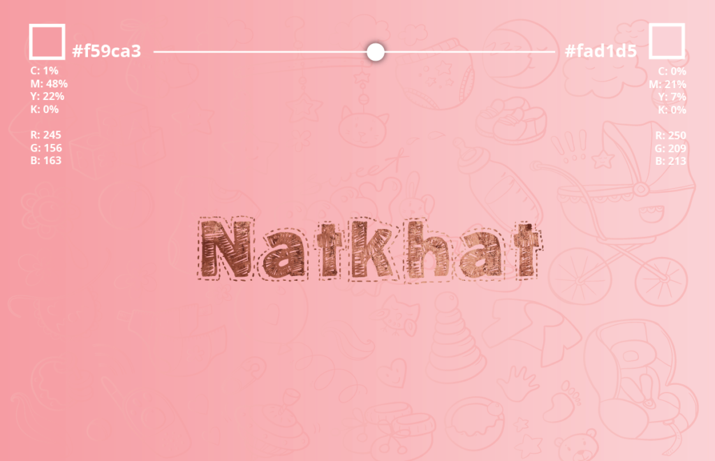
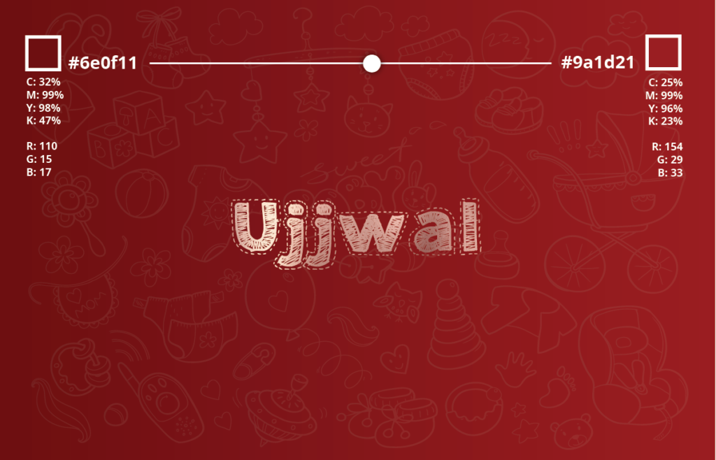
We chose this vibrant palette for Tiny Treasures to make each product category stand out while keeping a cohesive brand feel. Bright tones like #7ac14b and #ffc908 bring fun and energy, while #5c5c5c adds balance, creating a unified, playful, and premium look across all boxes.
Typography
Typography is essential to defining a brand’s identity. The right fonts communicate your brand’s personality, create consistency, and enhance recognition. Therefore, we choose typography that aligns with your message, ensuring clarity and impact across all platforms.

What fonts did we use?
Beyond the Mountains
is a whimsical, hand-lettered typeface known for its flowing, cursive strokes and friendly appeal. Its soft curves and smooth lines create a sense of warmth and approachability, making it ideal for brands looking to convey care, creativity, and a personal touch.
The font blends elegance with playfulness, making it versatile for both formal and casual branding contexts.
The font blends elegance with playfulness, making it versatile for both formal and casual branding contexts.
Why did we choose Beyond The Mountains?
We chose “Beyond the Mountains” for Tiny Treasures because its playful, flowing design reflects the brand’s warmth and care for babies. The font’s softness and approachability align with the nurturing essence of Tiny Treasures, while its elegance adds a premium feel to the brand identity.
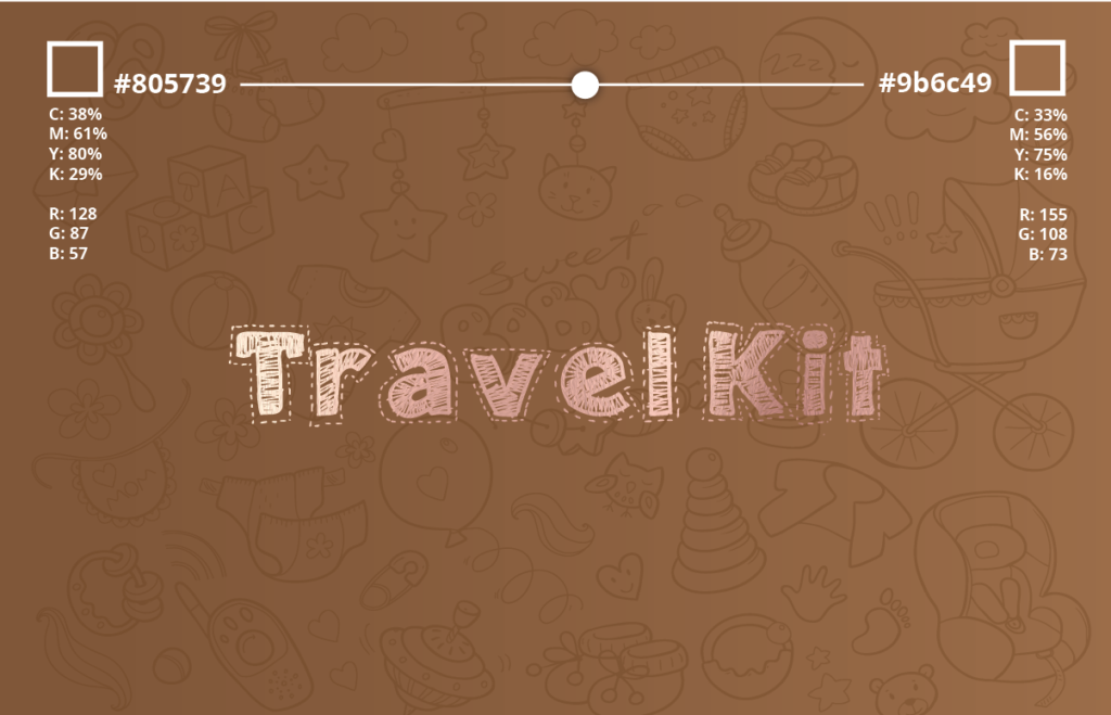
Seconday Typeface - Needlework
We selected Needlework as the secondary typeface for Tiny Treasures because of its handcrafted, delicate style. It adds a charming, personal touch to the brand, perfectly complementing the nurturing and bespoke nature of the products.
The font’s subtle detailing brings a sense of warmth and authenticity, reinforcing the brand’s focus on care and attention to detail.
The font’s subtle detailing brings a sense of warmth and authenticity, reinforcing the brand’s focus on care and attention to detail.
Print & Merchandise

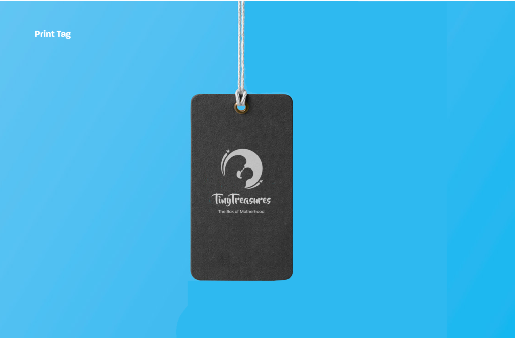
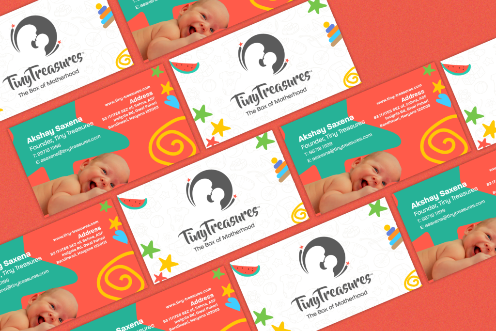
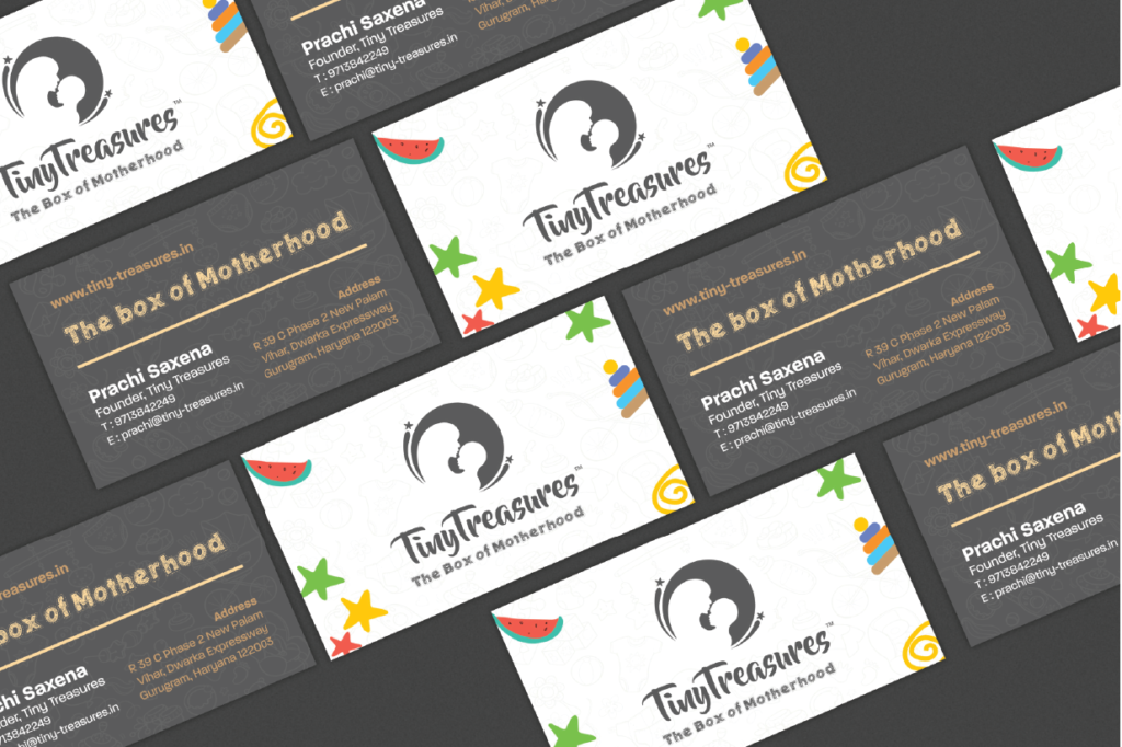
We designed cards and tags for Tiny Treasures using soft pastel colours and friendly typography, we created an inviting aesthetic that resonates with new parents. Playful illustrations and clear, informative text enhance the brand identity while providing essential product information for a delightful and practical experience

