BenchMark
About BenchMark
Overview: Lotus Analytics (now BenchMark) is a company that offers advanced analytics solutions for modern businesses, providing actionable insights across various industries to enhance decision-making and optimize operations.
Location: India
Target Market: Benchmark serves diverse industries, including finance, supply chain management, and healthcare, catering to businesses of all sizes.
Location: India
Target Market: Benchmark serves diverse industries, including finance, supply chain management, and healthcare, catering to businesses of all sizes.
Branding Challenge
The existing branding for Benchmark lacked clarity and coherence, failing to effectively communicate its message. We needed to revamp the branding to clearly articulate the value of each product line while maintaining a unified identity.
“We’re changing the game in data analytics. BenchMark is going to become a new standard in insight, accessibility, and efficiency. We’re redefining how businesses harness data by pushing boundaries and leading with innovation, transforming the way organizations make smarter, data-driven decisions.”
- BenchMark Team
Our Approach
At BrandWorks, We chose the name Benchmark for the analytics brand to align with its data-driven focus and encompass its diverse range of services and products. This name not only reflects the industry it serves but also integrates the various offerings into a cohesive cluster.
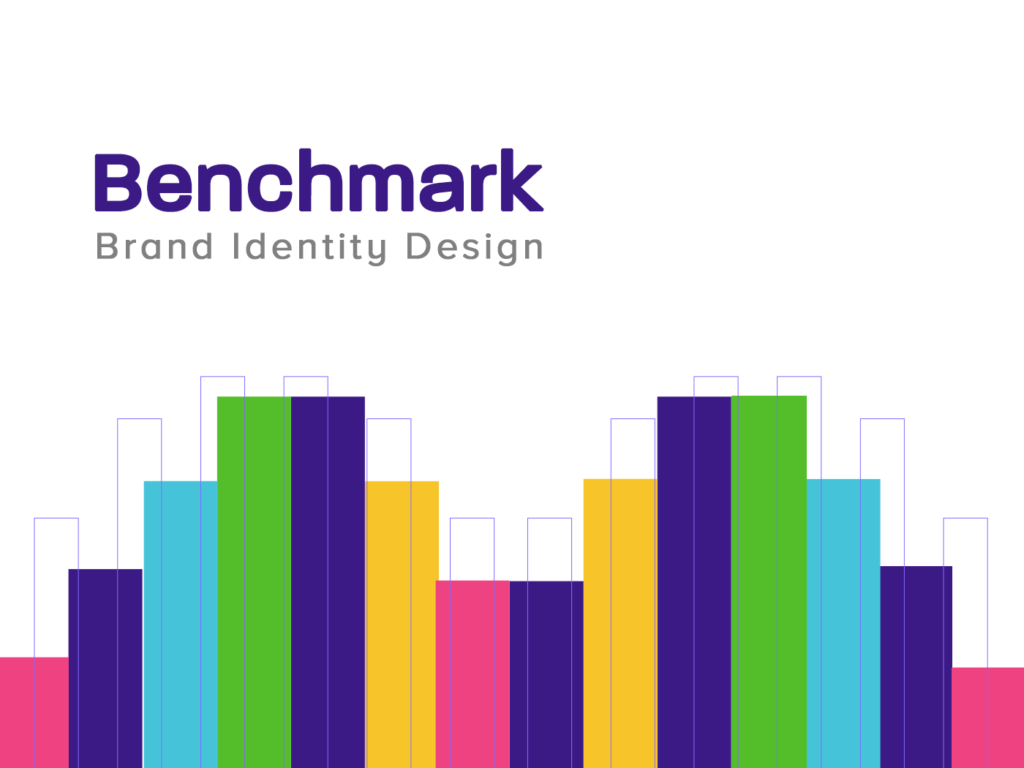
Visual identity work without deep research is futile. We started with a lot of minute details and came up with two main attributes that can describe the analytics business: Bars & Thresholds .
Logo Construction
For Benchmark, we designed a logo that embodies the brand’s dedication to clarity and precision in data analytics.
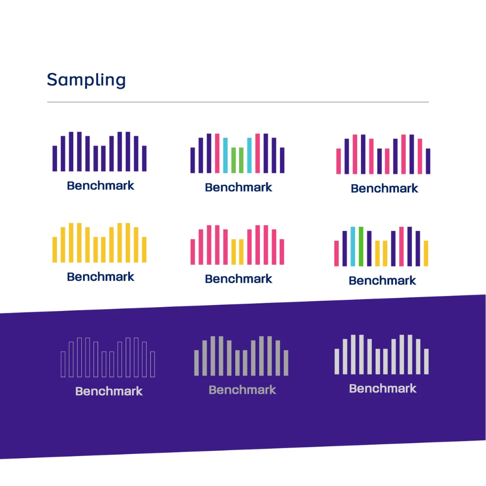
The design features the use bars and thresholds to symbolize data measurement and surpassing limits. Clean lines and a dynamic color palette highlight Benchmark’s focus on transforming data into actionable insights, reflecting their leadership and innovation in analytics.
The design features the use bars and thresholds to symbolize data measurement and surpassing limits. Clean lines and a dynamic color palette highlight Benchmark’s focus on transforming data into actionable insights, reflecting their leadership and innovation in analytics.
Utilising the Golden Ratio
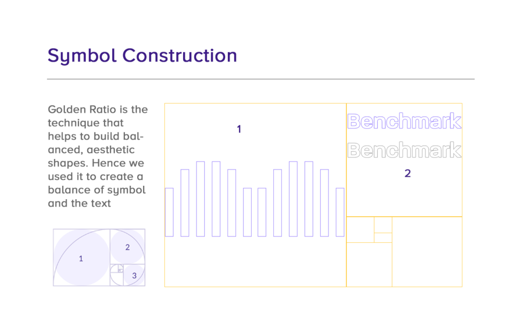
For Benchmark, we employed the golden ratio to infuse the logo with balance and precision. This principle, widely recognized for its aesthetic appeal, structured the logo’s proportions to achieve a natural sense of harmony. By integrating the golden ratio, we ensured that the logo maintains a professional and cohesive appearance across various applications, symbolizing Benchmark’s commitment to clarity and excellence in data analytics.
Colour Scheme
Colour schemes are crucial for brand identity, shaping perceptions and evoking emotions. We choose colours that reflect your brand’s values and ensure consistency across all platforms, enhancing recognition and impact.
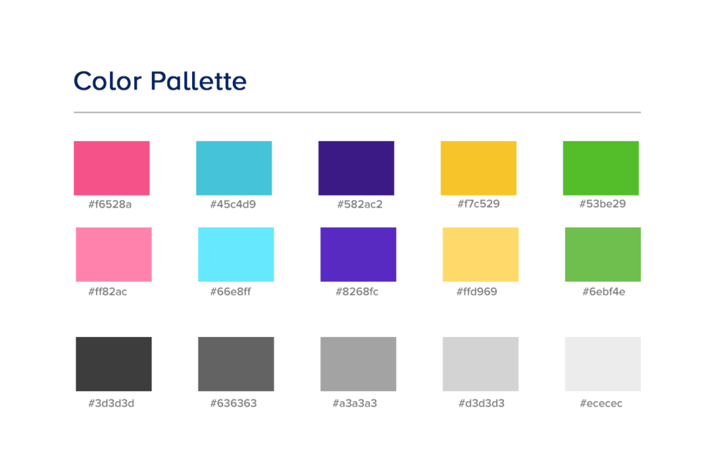
What Color Palette did we use?
We selected this color palette for Benchmark to reflect innovation and versatility. The vibrant colors, ranging from bold pinks and teals to dynamic greens and purples, embody the brand’s clarity and insight in data analytics, creating a modern, engaging identity.
Typography
Typography is essential to defining a brand’s identity. The right fonts communicate your brand’s personality, create consistency, and enhance recognition. Therefore, we choose typography that aligns with your message, ensuring clarity and impact across all platforms.
What fonts did we use?
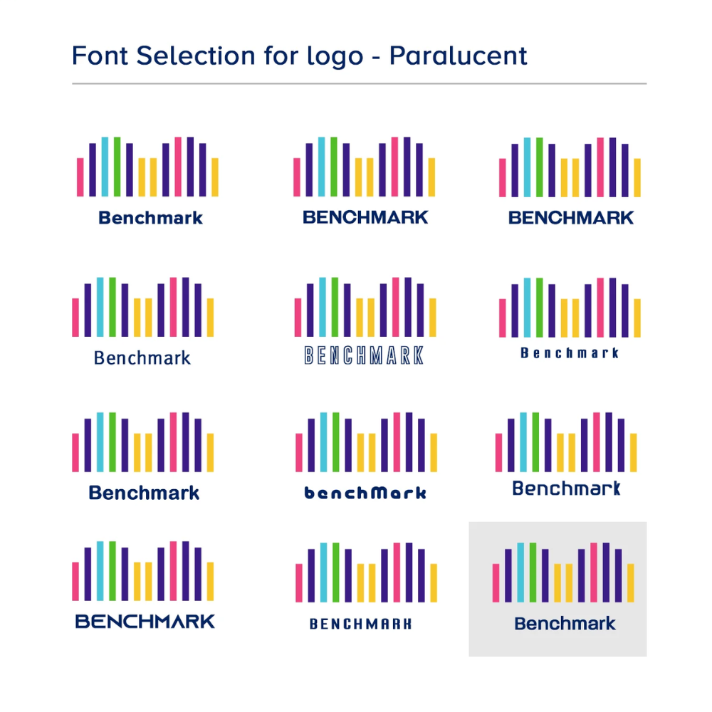
Paralucent is a versatile, modern sans serif available in seven weights, from Thin to Heavy, with italics, and additional stencil and text families.
Key design elements include balanced negative space, shorter arms on J, L, and T, wider M and W, and a lower bar on A for better legibility. A high x-height and consistent typographic features enhance cohesion and readability.
Key design elements include balanced negative space, shorter arms on J, L, and T, wider M and W, and a lower bar on A for better legibility. A high x-height and consistent typographic features enhance cohesion and readability.
Why did we choose Paralucent?
We chose Paralucent for Benchmark because its modern, clean design reflects clarity and precision. Its versatile weights and balanced letterforms convey professionalism and reliability, aligning perfectly with Benchmark’s focus on data analytics.
Sub Brand Font Face - Unique
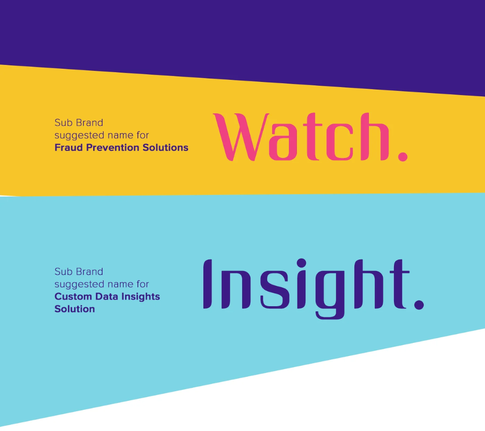
Lotus Analytics has a cluster of products and services which makes it inevitable to create sub-brands. Hence, we picked “Unique,” another font which, when combined with the main logo, gains more power.
Sub Brands
