Trulabs
About Trulabs
Overview: TruLabs is a leading diagnostic provider transforming pathology services in India’s tier 1 and 2 cities, focusing on high-quality, reliable diagnostics and innovative solutions for underserved markets.
Location: India
Target Market: Healthcare providers, clinics, and patients in tier 1 and 2 cities, where access to quality diagnostics is limited.
Location: India
Target Market: Healthcare providers, clinics, and patients in tier 1 and 2 cities, where access to quality diagnostics is limited.

Branding Challenge
TruLabs approached us with the goal of developing a fresh, modern identity for their pathology lab services. They sought to create new packaging designs for their diagnostic kits and establish a comprehensive brand strategy. This included naming, storytelling, and creative direction for their full range of services, aimed at reflecting innovation, precision, and trust in the medical field.
"We want to revolutionize the way pathology services are perceived. We’re not just another lab—we aim to set new standards in accuracy, reliability, and trust. We’re transforming diagnostics by being bold in our approach, challenging the norms, and leading a movement in medical innovation."
- Trulabs Team
Our Approach
At BrandWorks, We approached TruLabs’ rebranding with a focus on clarity, trust, and professionalism to connect with healthcare providers and patients. By analyzing their market, we crafted a strategy emphasizing TruLabs' precision and innovation, featuring compelling storytelling and sleek diagnostic packaging. Every design choice reinforced their vision of becoming a trusted leader in pathology.

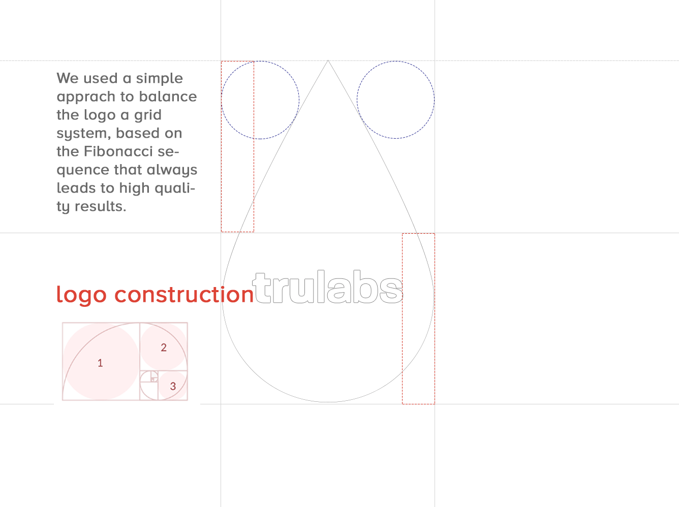
Logo Construction

For TruLabs, we designed a logo that embodies precision, trust, and innovation in pathology. By focusing on the brand’s core values of accuracy and reliability, we created a symbol with clean, structured lines and subtle organic elements reflecting health and diagnostics.
The bold red color signifies vitality and urgency, while neutral grays convey stability and trust. The logo is crafted to resonate with both medical professionals and patients, reinforcing TruLabs as a credible and innovative leader in the industry.
The bold red color signifies vitality and urgency, while neutral grays convey stability and trust. The logo is crafted to resonate with both medical professionals and patients, reinforcing TruLabs as a credible and innovative leader in the industry.
Utilising the Golden Ratio

In designing the TruLabs logo, we used the golden ratio to ensure balance, harmony, and visual appeal. This mathematical principle, often seen in nature, structured the logo’s proportions for natural alignment and precision. The golden ratio enhances the logo’s scalability and versatility, reflecting TruLabs’ meticulous nature and commitment to excellence in pathology.
Colour Scheme
Colour schemes are crucial for brand identity, shaping perceptions and evoking emotions. We choose colours that reflect your brand’s values and ensure consistency across all platforms, enhancing recognition and impact.

What Color Palette did we use?
We selected TruLabs’ colour palette to reflect precision, reliability, and innovation. The reds (#b12029, #c72927, #db2e2e, #f18e85) signify vitality and urgency, while promoting trust and professionalism. Dark grays (#373737, #464646, #707271, #76777b) add depth and sophistication, and lighter grays (#c8c8c8) ensure a calm, approachable feel. This palette conveys a trustworthy, forward-thinking identity aligned with TruLabs’ commitment to excellence.
Typography
Typography is essential to defining a brand’s identity. The right fonts communicate your brand’s personality, create consistency, and enhance recognition. Therefore, we choose typography that aligns with your message, ensuring clarity and impact across all platforms.

What fonts did we use?
Paralucent is a versatile, modern sans serif available in seven weights, from Thin to Heavy, with italics, and additional stencil and text families.
Key design elements include balanced negative space, shorter arms on J, L, and T, wider M and W, and a lower bar on A for better legibility. A high x-height and consistent typographic features enhance cohesion and readability.
Key design elements include balanced negative space, shorter arms on J, L, and T, wider M and W, and a lower bar on A for better legibility. A high x-height and consistent typographic features enhance cohesion and readability.
Why did we choose Paralucent?
We chose Paralucent for TruLabs for its modern, clean, and highly legible design, aligning with the precision and professionalism of the brand. Its sleek, versatile nature conveys innovation and trust—essential in the medical field. The font’s contemporary feel reinforces TruLabs’ commitment to cutting-edge diagnostics and reliable service.
Visiting Cards
For TruLabs' contact cards, we designed two versions—one in bold red and the other in crisp white. Both versions feature clean typography and the TruLabs logo prominently, maintaining a sleek, modern look. The red cards exude energy and urgency, while the white cards offer a sense of professionalism and simplicity. Together, these designs reflect TruLabs’ values of precision, trust, and innovation, ensuring a strong impression in every interaction.


looking for
branding solutions?
Let's get in touch
We’re here to help you build a unique brand identity that resonates. Contact us today to start your journey!

